Data Analysis in Jupyter Notebook (Part 2)
Contents
Data Analysis in Jupyter Notebook (Part 2)#
We will reproduce parts of a recent publication:
Wolf, S. and Mahecha, M. D. and Sabatini, F. M. and Wirth, C. and Bruelheide, H. and Kattge, J. and Moreno Martínez, Á. and Mora, K. and Kattenborn, T., Citizen science plant observations encode global trait patterns. Nat Ecol Evol (2022). https://doi.org/10.1038/s41559-022-01904-x
The full documentation can found at: https://github.com/sojwolf/iNaturalist_traits. By the way, this is a Jupyter Book, which is a great way to then publish your code and workflow. We will cover how to create and publish a Jupyter Book in the last section of this workshop.
Research question#
Can we use citizen science plant observations to map plant functional traits on a global scale?
Plant traits are morphological, anatomical, physiological, biochemical and phenological characteristics of plants. They determine how a plant responds to and shapes its environment. The collective range of all traits of all plants within a plant community defines this community’s functional diversity (see Kattge et al. 2020).

The Data#
iNaturalist - species observations
TRY - plant trait measurements
sPlotOpen - vegetaiton community data
iNaturalist citizen science observations#
For this workshop we will use the following download: GBIF.org (4 January 2022) GBIF Occurrence Download https://doi.org/10.15468/dl.34tjre
For future reference, if you would like to use the most recent data: Follow the above link and click ‘Rerun Query’ and proceed to download. For this analysis the ‘simple’ version is sufficient.
🤖 Try it!#
Take a few minutes to explore iNaturalist “research-grade” dataset on www.gbif.org.
1. How is “research-grade” defined in the iNaturalist dataset?
2. Rerun the query - how many vascular plant observations are in the iNaturalist “research-grade” dataset to date?
For this tutorial, the following dataframe is already preprocessed a bit. Only the following columns were extracted and we will disregard subspecies level: the species names contain only genus and species.
gbifID
scientificName
decimalLatitude
decimalLongitude
eventDate
dateIdentified
%ls
Data/
Figures/
README.md
Winterschool_2022_Additional_Materials.ipynb
Winterschool_2022_Jupyter_Data_Analysis.ipynb
Winterschool_2022_Jupyter_Introduction.ipynb
Winterschool_2022_R_Kernel.ipynb
binder/
import pandas as pd # for handling dataframes in python

iNat = pd.read_csv('Data/iNat/observations.csv')
iNat.head()
🤖 Try it!#
1. How many observations does this dataset contain?
2. How many unique species?
3. The number of observations per unique species is highly squewed. Most species are rare and few are common. Plot a histogramm showing this frequency distribution of species.
# Number of observations in dataset
# Number of unique species
# Histogram of species frequencies
Plot density of observations#
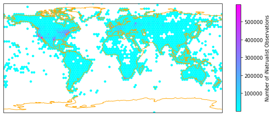
One version of plotting the density, is by aggregating the iNaturalist observations in hexagonal bins and count the number of observations per hexagon. The function hexbin provides this functionality.
import matplotlib.pyplot as plt # main Python plotting library
import seaborn as sns # pretty plots
import cartopy.crs as ccrs # maps

def hexmap(long, lat, label):

    ax = plt.subplot(projection=ccrs.PlateCarree())

    # hexbin aggregates observations in hexagonal bins and plots the density
    hb = ax.hexbin(long,
          lat,
          mincnt=1, # min. nuber of observations per hexagon
          gridsize=(100, 30), # bin size
          cmap="cool",
          transform=ccrs.PlateCarree(),
          extent=[-180, 180, -90, 90],
          linewidths=0.1)

    # add coastline outline and extent of map:
    ax.coastlines(resolution='110m', color='orange', linewidth=1)
    ax.set_extent([-180, 180, -90, 90], ccrs.PlateCarree())

    cb = fig.colorbar(hb, ax=ax, shrink=0.4)
    cb.set_label(label)
Apply the hexmap function to our iNaturalist observations and save output as .pdf:
#determine figure size
fig = plt.figure(figsize=(10, 10))
hexmap(iNat['decimalLongitude'], iNat['decimalLatitude'], "Number of iNatrualist Observations")

#optional: Save figure
#plt.savefig('iNat_density_hex.pdf', bbox_inches='tight')
🤖 Try it!#
The frquency distribution of observations seems to be skewed. Change the color bar to log-scale.
Hint: Look up matplotlib.axes.Axes.hexbin.
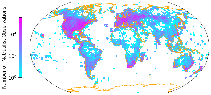
A second plotting option is to grid the data into a latitude/longitude grid. Then we can project our map onto a more realistic representation of the spherical Earth, such as the Robinson projection. The previously used hexbin function does not have a reprojection functionality implemented.
from matplotlib.colors import LogNorm, Normalize, BoundaryNorm
import cartopy.feature as cfeature # maps
import numpy as np

def gridmap(long, lat, label, projection, colorbar=True):

    plt.rcParams.update({'font.size': 15})

    Z, xedges, yedges = np.histogram2d(np.array(long,dtype=float),
                                   np.array(lat),bins = [181, 91])

    #https://stackoverflow.com/questions/67801227/color-a-2d-histogram-not-by-density-but-by-the-mean-of-a-third-column
    #https://medium.com/analytics-vidhya/custom-strava-heatmap-231267dcd084

    #let function know what projection provided data is in:
    data_crs = ccrs.PlateCarree()

    #for colorbar
    cmap = plt.get_cmap('cool')
    im_ratio = Z.shape[0]/Z.shape[1]

    #plot map
    #create base plot of a world map
    ax = fig.add_subplot(1, 1, 1, projection=projection) # I used the PlateCarree projection from cartopy

    # set figure to map global extent (-180,180,-90,90)
    ax.set_global()


    #add grid with values
    im = ax.pcolormesh(xedges, yedges, Z.T, cmap="cool", norm=LogNorm(), transform=data_crs)

    #add coastlines
    ax.coastlines(resolution='110m', color='orange', linewidth=1.3)

    #add color bar
    if colorbar==True:
        fig.colorbar(im,fraction=0.046*im_ratio, pad=0.04, shrink=0.3, location="left", label=label)
Apply the gridmap function to our iNaturalist observations and save output as .pdf. You can also experiment with other projections. See https://scitools.org.uk/cartopy/docs/v0.15/crs/projections.html for inspiration:
fig = plt.figure(figsize=(12, 12))

gridmap(iNat['decimalLongitude'], iNat['decimalLatitude'], "Number of iNatrualist Observations", ccrs.Robinson(0))

#Optional
#plt.savefig('/Figures/iNat_density_Robinson.pdf', bbox_inches='tight')
🤖 Try it!#
Take a few minutes to play around with this function:
1. Change the projection of the map. Hint: Look up “cartopy ccrs projections”.
2. Change the colors of the map.
Extra credit: Filter the iNaturalist dataset for a species of your interest and plot its global distribution as documented by citizen scientists. Hint:
To subset df: df[df['column_name']=="your species name"]
Get list of 10 most common species: iNat['scientificName'].value_counts()[:10].index.tolist()
Make global trait maps#
# enables the %%R magic, needs to be installed and then activated only once per Notebook
%load_ext rpy2.ipython
%%R

# Load iNat Data
iNat <- data.table::fread('Data/iNat_TRY_log.csv', data.table=F, showProgress=F)
gc()
%R head(iNat)
| gbifID | scientificName | decimalLatitude | decimalLongitude | eventDate | dateIdentified | Dispersal.unit.length | Leaf.Area | SLA | Leaf.C | ... | Leaf.delta15N | Leaf.N.P.ratio | Leaf.P | Plant.Height | Seed.mass | Seed.length | Seeds.per.rep..unit | Stem.conduit.density | SSD | Conduit.element.length | |
|---|---|---|---|---|---|---|---|---|---|---|---|---|---|---|---|---|---|---|---|---|---|
| 1 | 1.229615e+09 | Commelina communis | 35.987483 | -79.057546 | 2013-07-07T00:00:00 | 2013-07-07T20:33:11 | NaN | NaN | NaN | NaN | ... | NaN | 2.5362 | 0.536493 | NaN | 2.13771 | NaN | NaN | NaN | NaN | NaN |
| 2 | 3.384000e+09 | Commelina communis | 42.093762 | -75.923660 | 2021-08-23T13:06:06 | 2021-09-17T21:15:37 | NaN | NaN | NaN | NaN | ... | NaN | 2.5362 | 0.536493 | NaN | 2.13771 | NaN | NaN | NaN | NaN | NaN |
| 3 | 1.807277e+09 | Commelina communis | 40.787636 | -73.933728 | 2017-09-04T12:47:58 | 2017-09-04T21:58:57 | NaN | NaN | NaN | NaN | ... | NaN | 2.5362 | 0.536493 | NaN | 2.13771 | NaN | NaN | NaN | NaN | NaN |
| 4 | 3.355124e+09 | Commelina communis | 39.643158 | -76.764245 | 2020-08-26T10:19:56 | 2020-08-27T13:21:22 | NaN | NaN | NaN | NaN | ... | NaN | 2.5362 | 0.536493 | NaN | 2.13771 | NaN | NaN | NaN | NaN | NaN |
| 5 | 1.802639e+09 | Commelina communis | 43.109505 | 1.622543 | 2017-10-21T10:01:00 | 2017-10-21T09:02:42 | NaN | NaN | NaN | NaN | ... | NaN | 2.5362 | 0.536493 | NaN | 2.13771 | NaN | NaN | NaN | NaN | NaN |
| 6 | 1.898807e+09 | Commelina communis | 40.716092 | -73.955880 | 2018-08-19T09:25:41 | 2018-08-19T13:35:18 | NaN | NaN | NaN | NaN | ... | NaN | 2.5362 | 0.536493 | NaN | 2.13771 | NaN | NaN | NaN | NaN | NaN |
6 rows × 24 columns
%%R

library(raster)

# get coordinates
xy <- cbind(iNat$decimalLongitude, iNat$decimalLatitude)
# raster dimensions 2 degree resolution map
r2 <- raster(ncols = 180, nrows = 90)
%%R

loop.vector <- 7:24 # loop over trait columns in dataframe
loop.vector
[1] 7 8 9 10 11 12 13 14 15 16 17 18 19 20 21 22 23 24
%%R

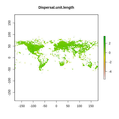
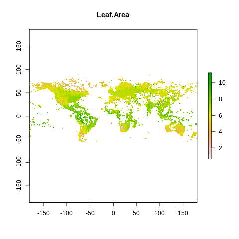
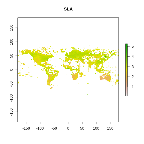
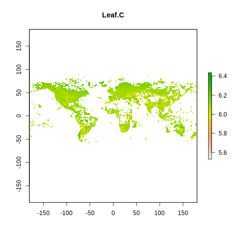
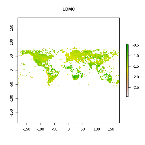
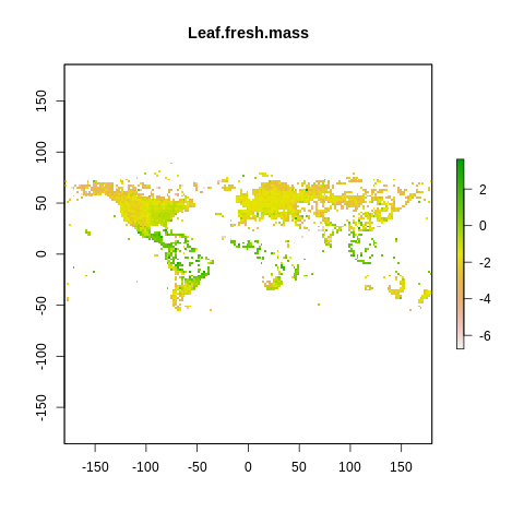
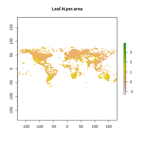
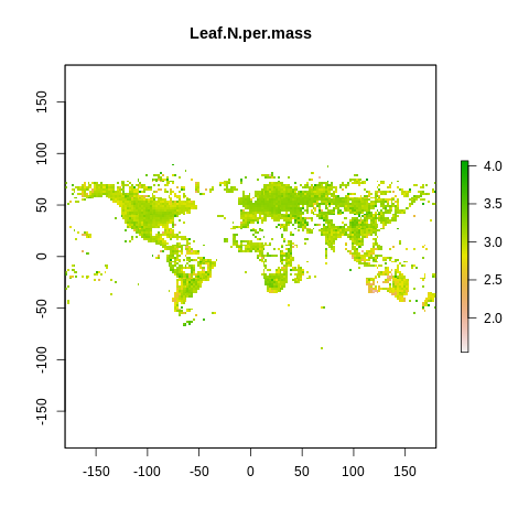
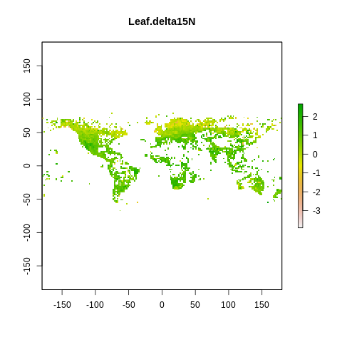
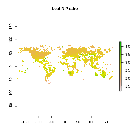
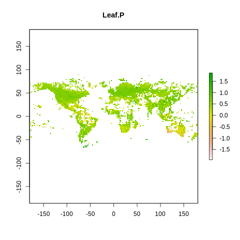
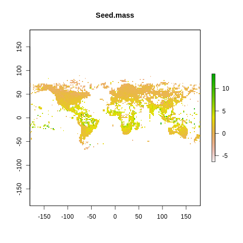
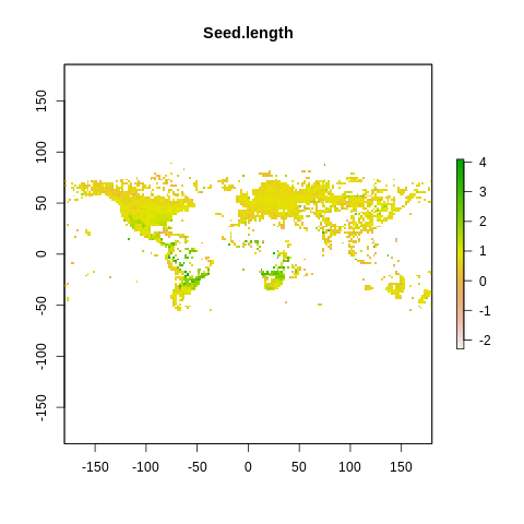
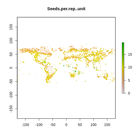
# export exp(ln()) maps in GeoTiff format

for (i in loop.vector) { # Loop over loop.vector
    vals <- iNat[,i]
    name <- colnames(iNat[i])
    # create a raster of all data and aggregate all observations as mean
    raster2 <- rasterize(xy, r2, vals, fun = mean)
    raster2[is.infinite(raster2)] <- NA
    crs(raster2) <- "+proj=longlat" #set projection

    # plot raster to check output
    plot(raster2, main=name)

    # write raster to GeoTiff
    filename = paste(name, "_iNat_2deg_ln.tif", sep="")
    writeRaster(raster2, filename, overwrite=TRUE)

}

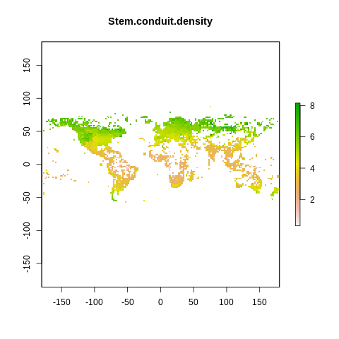
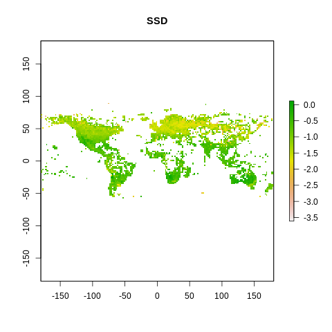
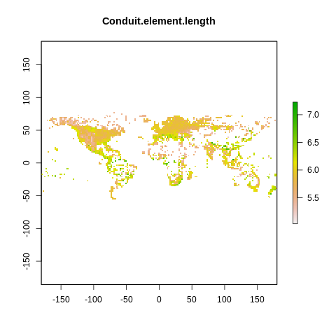
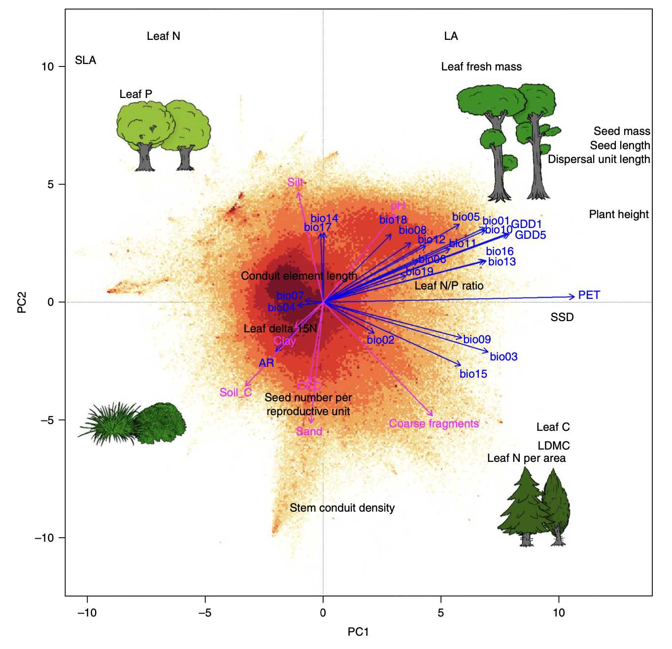
The global spectrum of plant form and function#
a) Díaz et al. 2016
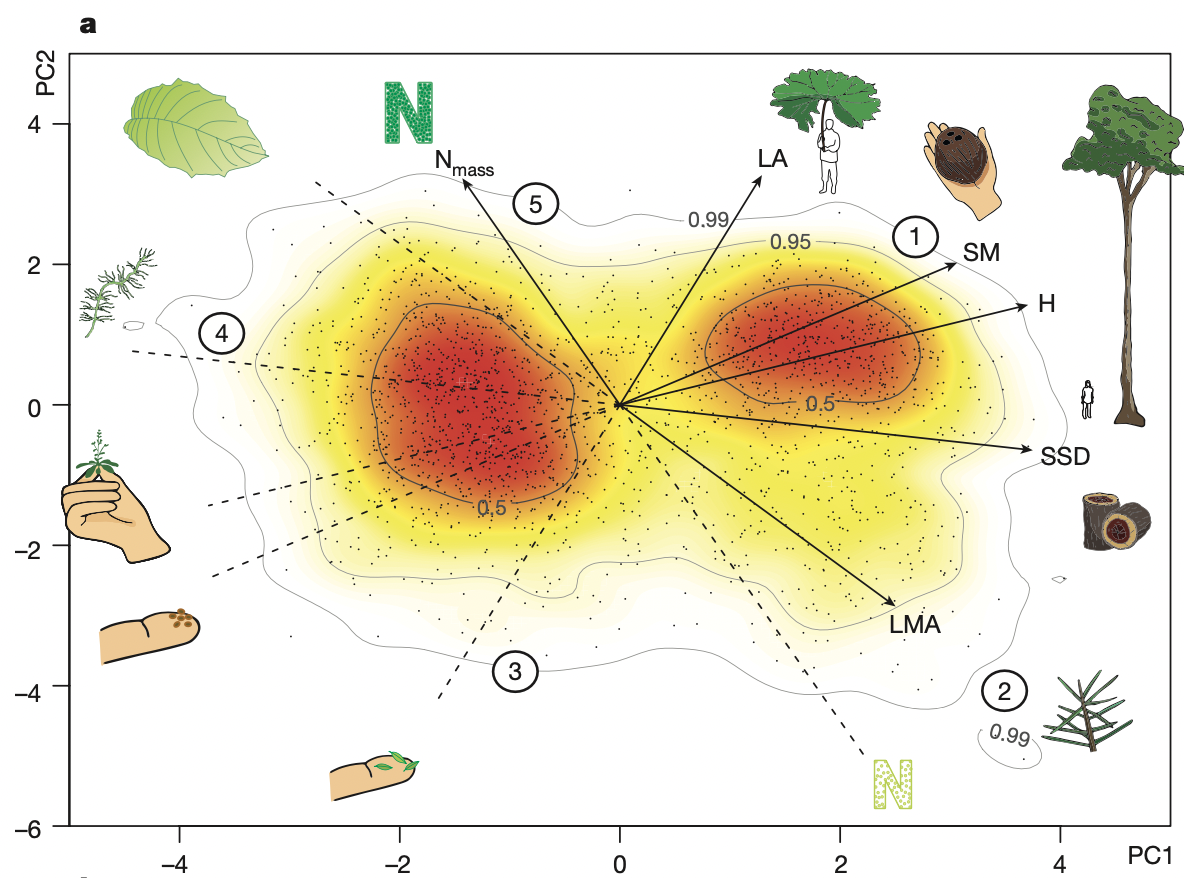
b) Bruelheide et al. 2018
%%R

files <- list.files(path=".", pattern="_iNat_2deg_ln.tif", all.files=FALSE, full.names=TRUE, recursive=TRUE)
s <- stack(files)
%%R
files
 [1] "./Conduit.element.length_iNat_2deg_ln.tif"
 [2] "./Dispersal.unit.length_iNat_2deg_ln.tif"
 [3] "./LDMC_iNat_2deg_ln.tif"
 [4] "./Leaf.Area_iNat_2deg_ln.tif"
 [5] "./Leaf.C_iNat_2deg_ln.tif"
 [6] "./Leaf.delta15N_iNat_2deg_ln.tif"
 [7] "./Leaf.fresh.mass_iNat_2deg_ln.tif"
 [8] "./Leaf.N.P.ratio_iNat_2deg_ln.tif"
 [9] "./Leaf.N.per.area_iNat_2deg_ln.tif"
[10] "./Leaf.N.per.mass_iNat_2deg_ln.tif"
[11] "./Leaf.P_iNat_2deg_ln.tif"
[12] "./Plant.Height_iNat_2deg_ln.tif"
[13] "./Seed.length_iNat_2deg_ln.tif"
[14] "./Seed.mass_iNat_2deg_ln.tif"
[15] "./Seeds.per.rep..unit_iNat_2deg_ln.tif"
[16] "./SLA_iNat_2deg_ln.tif"
[17] "./SSD_iNat_2deg_ln.tif"
[18] "./Stem.conduit.density_iNat_2deg_ln.tif"
%%R
trait_names <- c(files)
trait_names <- gsub("*_iNat_2deg_ln.tif", "", trait_names)
trait_names <- gsub(".*./", "", trait_names)

names(s) <- trait_names
s
class      : RasterStack
dimensions : 90, 180, 16200, 18  (nrow, ncol, ncell, nlayers)
resolution : 2, 2  (x, y)
extent     : -180, 180, -90, 90  (xmin, xmax, ymin, ymax)
crs        : NA
names      : Conduit.element.length, Dispersal.unit.length,       LDMC,  Leaf.Area,     Leaf.C, Leaf.delta15N, Leaf.fresh.mass, Leaf.N.P.ratio, Leaf.N.per.area, Leaf.N.per.mass,     Leaf.P, Plant.Height, Seed.length,  Seed.mass, Seeds.per.rep..unit, ...
min values :              5.0282569,            -5.6549921, -2.9296312,  0.6265936,  5.5286350,    -3.9120231,      -6.7456365,      1.1907276,      -1.2943509,       1.5475625, -1.9557816,   -3.6935570,  -2.3025851, -6.3584490,           0.0000000, ...
max values :              7.2274203,             3.5189805, -0.4491783, 11.2158442,  6.4358296,     2.6623552,       3.6270041,      4.2953291,       3.9186676,       4.0655332,  1.8614928,    4.2484951,   4.0943446, 13.2652512,          19.5192928, ...
%%R

df = as.data.frame(s)
head(df, 3)
  Conduit.element.length Dispersal.unit.length LDMC Leaf.Area Leaf.C
1                     NA                    NA   NA        NA     NA
2                     NA                    NA   NA        NA     NA
3                     NA                    NA   NA        NA     NA
  Leaf.delta15N Leaf.fresh.mass Leaf.N.P.ratio Leaf.N.per.area Leaf.N.per.mass
1            NA              NA             NA              NA              NA
2            NA              NA             NA              NA              NA
3            NA              NA             NA              NA              NA
  Leaf.P Plant.Height Seed.length Seed.mass Seeds.per.rep..unit SLA SSD
1     NA           NA          NA        NA                  NA  NA  NA
2     NA           NA          NA        NA                  NA  NA  NA
3     NA           NA          NA        NA                  NA  NA  NA
  Stem.conduit.density
1                   NA
2                   NA
3                   NA
%%R

summary(df)
 Conduit.element.length Dispersal.unit.length      LDMC          Leaf.Area
 Min.   :5.028          Min.   :-5.655        Min.   :-2.930   Min.   : 0.627
 1st Qu.:5.659          1st Qu.: 0.793        1st Qu.:-1.519   1st Qu.: 5.791
 Median :5.881          Median : 1.035        Median :-1.395   Median : 6.663
 Mean   :5.875          Mean   : 0.976        Mean   :-1.375   Mean   : 6.607
 3rd Qu.:6.093          3rd Qu.: 1.218        3rd Qu.:-1.227   3rd Qu.: 7.488
 Max.   :7.227          Max.   : 3.519        Max.   :-0.449   Max.   :11.216
 NA's   :13890          NA's   :13382         NA's   :12914    NA's   :12820
     Leaf.C      Leaf.delta15N    Leaf.fresh.mass  Leaf.N.P.ratio
 Min.   :5.529   Min.   :-3.912   Min.   :-6.746   Min.   :1.191
 1st Qu.:6.071   1st Qu.: 0.193   1st Qu.:-2.367   1st Qu.:2.348
 Median :6.096   Median : 0.834   Median :-1.638   Median :2.478
 Mean   :6.098   Mean   : 0.748   Mean   :-1.581   Mean   :2.512
 3rd Qu.:6.126   3rd Qu.: 1.281   3rd Qu.:-0.941   3rd Qu.:2.665
 Max.   :6.436   Max.   : 2.662   Max.   : 3.627   Max.   :4.295
 NA's   :12874   NA's   :13495    NA's   :13727    NA's   :12888
 Leaf.N.per.area  Leaf.N.per.mass     Leaf.P        Plant.Height
 Min.   :-1.294   Min.   :1.548   Min.   :-1.956   Min.   :-3.694
 1st Qu.: 0.202   1st Qu.:2.961   1st Qu.: 0.358   1st Qu.:-0.637
 Median : 0.368   Median :3.078   Median : 0.562   Median :-0.033
 Mean   : 0.419   Mean   :3.059   Mean   : 0.515   Mean   : 0.137
 3rd Qu.: 0.559   3rd Qu.:3.184   3rd Qu.: 0.714   3rd Qu.: 1.016
 Max.   : 3.919   Max.   :4.066   Max.   : 1.861   Max.   : 4.248
 NA's   :12770    NA's   :12632   NA's   :12710    NA's   :12469
  Seed.length       Seed.mass      Seeds.per.rep..unit      SLA
 Min.   :-2.303   Min.   :-6.358   Min.   : 0.000      Min.   :0.120
 1st Qu.: 0.557   1st Qu.: 0.235   1st Qu.: 6.374      1st Qu.:2.523
 Median : 0.755   Median : 1.138   Median : 7.872      Median :2.777
 Mean   : 0.809   Mean   : 1.495   Mean   : 7.692      Mean   :2.715
 3rd Qu.: 0.953   3rd Qu.: 2.520   3rd Qu.: 8.945      3rd Qu.:3.003
 Max.   : 4.094   Max.   :13.265   Max.   :19.519      Max.   :5.250
 NA's   :13455    NA's   :12458    NA's   :14146       NA's   :12628
      SSD         Stem.conduit.density
 Min.   :-3.612   Min.   :0.313
 1st Qu.:-1.307   1st Qu.:3.195
 Median :-0.927   Median :4.463
 Mean   :-0.977   Mean   :4.407
 3rd Qu.:-0.604   3rd Qu.:5.590
 Max.   : 0.115   Max.   :8.158
 NA's   :13003    NA's   :13337
%%R

library(pcaMethods)

# convert back to original dimensions
df_exp <- exp(df)

# remove rows where all are NA
df_exp <- df_exp[rowSums(is.na(df_exp)) != ncol(df_exp), ]

# scale all variables
df_st <- scale(df_exp)

# calculate probobalistic pca
result <- pca(df_st, method="ppca", nPcs=2) #includes a mean tranform
scores <- scores(result)
loadings <- loadings(result)
R[write to console]: Loading required package: Biobase

R[write to console]: Loading required package: BiocGenerics

R[write to console]:
Attaching package: ‘BiocGenerics’


R[write to console]: The following objects are masked from ‘package:raster’:

    as.data.frame, intersect, match, union, unique, which.max,
    which.min


R[write to console]: The following objects are masked from ‘package:stats’:

    IQR, mad, sd, var, xtabs


R[write to console]: The following objects are masked from ‘package:base’:

    anyDuplicated, append, as.data.frame, basename, cbind, colnames,
    dirname, do.call, duplicated, eval, evalq, Filter, Find, get, grep,
    grepl, intersect, is.unsorted, lapply, Map, mapply, match, mget,
    order, paste, pmax, pmax.int, pmin, pmin.int, Position, rank,
    rbind, Reduce, rownames, sapply, setdiff, sort, table, tapply,
    union, unique, unsplit, which.max, which.min


R[write to console]: Welcome to Bioconductor

    Vignettes contain introductory material; view with
    'browseVignettes()'. To cite Bioconductor, see
    'citation("Biobase")', and for packages 'citation("pkgname")'.


R[write to console]:
Attaching package: ‘pcaMethods’


R[write to console]: The following object is masked from ‘package:stats’:

    loadings
%%R
result
ppca calculated PCA
Importance of component(s):
                 PC1    PC2
R2            0.2938 0.1416
Cumulative R2 0.2938 0.4354
18 	Variables
3848 	Samples
13262 	NAs ( 19.147 %)
2 	Calculated component(s)
Data was mean centered before running PCA
Data was NOT scaled before running PCA
Scores structure:
[1] 3848    2
Loadings structure:
[1] 18  2
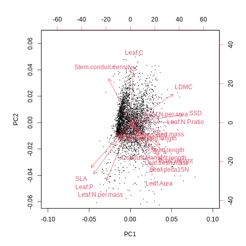
%%R

biplot(result,  xlabs = rep(".", nrow(df_st)), xlim=c(-0.07, 0.10), ylim=c(-0.06, 0.065), cex=0.7, col=c('grey', 'red'))
🤖 Try it!#
1. Optimize this biplot to make it more ledgible. Use R or use %Rget to use the results with Python.
2. Plot the variance explained by each principle component. The code above calculates only the first two, you might want to change this.
3. This PCA represents the so-called spectrum of plant form and function. Compare your biplot visually to the the previously published versions based a) on only TRY trait data and b) sPlotOpen community data (see figures above).